Editing an item
Tap the icon in the list to select it and display additional options at the bottom of the editor.
Next, tap the icon ![]() to open the properties of the selected item.
to open the properties of the selected item.
Item-settings
The following options are available for the icon:
| The text-size and color needs to be set in the settings for the kiosk-dataset, and cannot be set for individual icons. |
Type of the kiosk-icon
The first option to set for the icon is to set what should happen when the user taps the icon. Simply put, what should the device do when the user taps the icon?
List of Item types
The following list contains all available types available for a kiosk-item.
List of icon-types
| The type None has been created so the items in the kiosk can be placed anywhere on the grid by adding blank entries. |
| Type | Action | Additional settings |
|---|---|---|
None |
No functions linked |
None |
Folder |
Displays a folder containing other icons. |
Top menu bar title Enter a title that will be displayed in the kiosk when the folder is opened. |
Application |
Start an app that has been installed on the device. |
Application Select the app (or apk) to launch or resume. Data Data can be used to pass on information to the app that needs to start. For example, for the ZBOS Survey application, you can enter the name of the data source to start the application with (e.g. _data_source Talemate). Data is passed on as extras in a startup intent (See: Intent getExtras()) |
Image |
Displays an image in full-screen on the tablet. |
Image Select the image to be shown from the list of uploaded media on the device. |
Video |
Displays a video (with some controls) on the device. |
Video Select the video-file to play from the list of uploaded media on the device. |
Audio |
Plays a music-file in the background and shows the additional controls. |
Audio Select the audio-file to play from the list of uploaded media on the device. |
Composition |
Start playing an uploaded composition |
Composition Select the composition to be played from the list of uploaded compositions. Variables Variables can be used to pass on variables to the composition. This allows you to make dynamic compositions that adapt their behavior based on the given input variables. |
Website |
Displays a website in the built-in Kiosk |
Url Enter the link to the external website in the additional field. |
Mqtt |
This option will not be covered in this manual. |
|
Shortcut |
Links back to an existing folder in the kiosk. |
Shortcut Select the named folder to navigate back to available folders in the dataset. |
Call Help |
The device calls for help using the VoIP-system configured on the device. |
None |
|
Name
Tap the option Name to alter the title of the kiosk-item. The name will be displayed in the top-left of the item.
Voice commands
Tap the button Voice commands to open the list of voice commands.
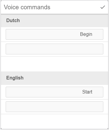
Enter the term the end-user can say in the specified language to start the item in the kiosk. The default entries will not be used for any other language.
| The device still needs to be listening by using the wakeword (e.g. OK James) before the device will listen to the command. |
| The languages for this modal need to be set in the translation-matrix for the kiosk. |
Icon
Tap the option Icon to select an image stored on the device to be shown as an icon. This icon will be displayed in the bottom-right of the icon.
| The default-icon for the app will be shown if no custom icon has been selected. |
Background
There are 2 types available for the background for the item, specifically a solid color or a gradient of two colors. Both options use a Color-wheel to select the color(s).
Color
If this option is selected, a color-wheel will be shown where the background-color can be selected. For more information, see the chapter Color-wheel.
Gradient
If this option is selected, 2 colors can be specified, specifically a top color and a bottom color. The background for the component will then be filled in gradually to flow from the top color into the bottom one.
Follow-up
In this option, you can select the type of action that the device should take once the action linked in the icon has run its course (e.g. video/composition has ended, the app is closed, …).
| A folder cannot be specified as a follow-up action, but a shortcut can be linked to go to the specified folder. |
Samples of items used in the kiosk
The following samples show some configurations for kiosk-items.
Application
| The required application must already be present on the device before it can be selected in the list. |
-
Configuration:
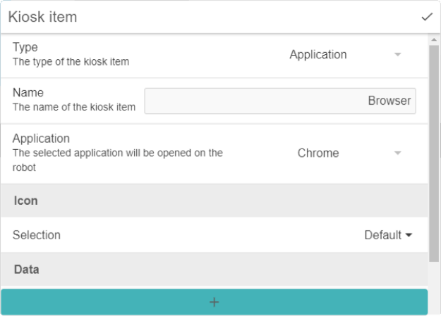
-
Output:
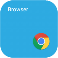
-
On tap:
Google Chrome app will be shown.
|
Survey dataset
A special case can be made for a Survey dataset, specifically the data_source attribute can be set to launch a specific dataset instead of launching the app showing the selection-screen with all available datasets.
-
Configuration of the item:
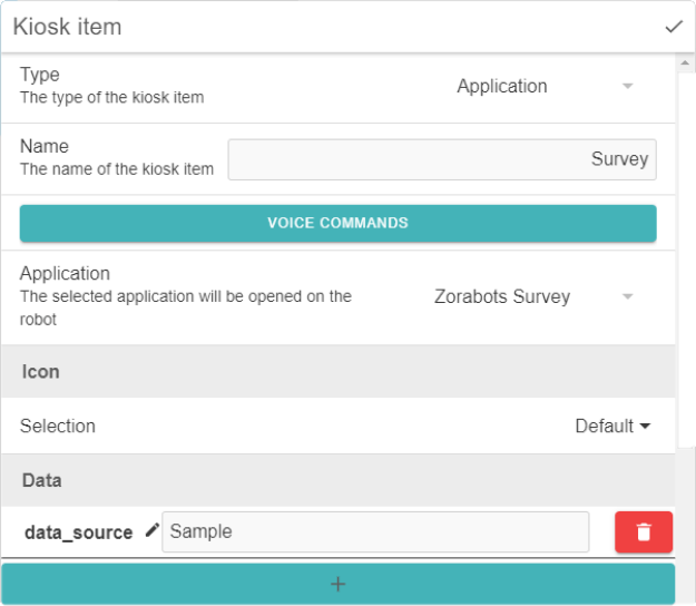
-
Tablet-output:
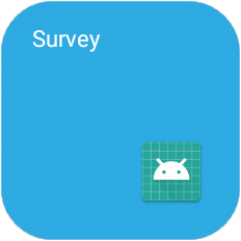
-
On tap:
The survey-app will be shown with the correct dataset loaded.
-
Notes
-
The selected datasource for the survey-app needs to be stored on the device.
-
The Name is capital-sensitive.
-